Website case study:
Total PFS
WEBSITE REDESIGN CASE STUDY OVERVIEW
A new website case study for a site we designed and built for Total PFS, a supplier of specialist print equipment in Weston-super-Mare
SketchCode Studio were asked by Total PFS to redesign their website as well as adding eCommerce functionality so that they could sell their print finishing equipment online.
Our last case study proved popular so we decided to write up another for this website redesign. Read on to see how we approached this web project and the benefits that adding eCommerce to a website can bring.
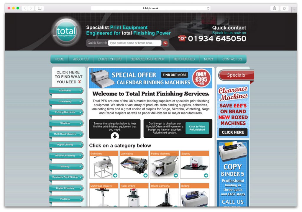
Total PFS had an old site that we’d previously designed for them which was dated, not mobile-friendly and had no eCommerce functionality.
Our task was to update the site so that they could sell their printing machines online while also improving the browsing experience for users on Mobiles and Tablets. Doing this would improve their conversion rates and open up their services to a wider audience.
We visited the Total PFS base of operations in Weston-super-Mare to get a better feel for the business. We also got some ‘behind the scenes’ photographs of the workers as we wanted to make sure there was a human element to the business portrayed on the site.
Want us to improve your website? Call 01823 765171
Having worked on the old site we were in the fortunate position of having years worth of analytic data to pour over and scrutinise before jumping into creating any wireframes.
Once we’d analysed the existing user flows and pages, we were able to restructure the site navigation and prioritise the content in a way that ensured it met the users demands while also mapping it against the priorities of the business.
This user research and data gathering gave us the insight into how people like to use their site, and what type of features should be brought to the fore on the new site.
A few of the things we highlighted on the old site that needed improving were:
- A complex navigation structure with multiple levels of drop-downs made the site hard to navigate on desktops and almost impossible when viewed on a mobile device
- Too many things on the page which were all fighting for the users attention.
- Default text size was a bit small for easy reading, especially for larger screens and made the site feel overly busy.
- The site was not responsive, which meant it could not adapt its layout to display well on small devices, such as mobile phones.
- The performance of the site was slow due to the amount of scripts and plugins which were being loaded via the old system. This problem was only exacerbated when viewing the site on a mobile.
Visual creation
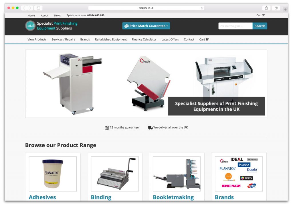
After we’d finalised the wireframes, we designed a select few pages in Photoshop. This was to establish the visual design fundamentals such as the colour palette and typefaces.
We decided to pair some of the existing colours used on Total’s branding with a light, minimalist pallet to help the products stand out on the page.
For the typeface, after testing various examples, we settled on Open Sans for both the headlines and for the body text. Open Sans has a wide range of weights that allow it to be flexible and at the same time remain easy to read at multiple sizes.
Improving the user experience
While writing this new website case study, I looked back through our initial research, and the things we’d picked up on was that one of the most confusing areas of the old site for users was the navigation.
The old structure had each of the product categories separated out into a list which was longer than most screens so it wasn’t possible to see all the categories as a glance. When selected there was multiple levels of slide-out sub-menus that could stretch out over the entire width of the desktop site. Needless to say that did not transfer to a good experience on narrower screened devices such as mobiles.
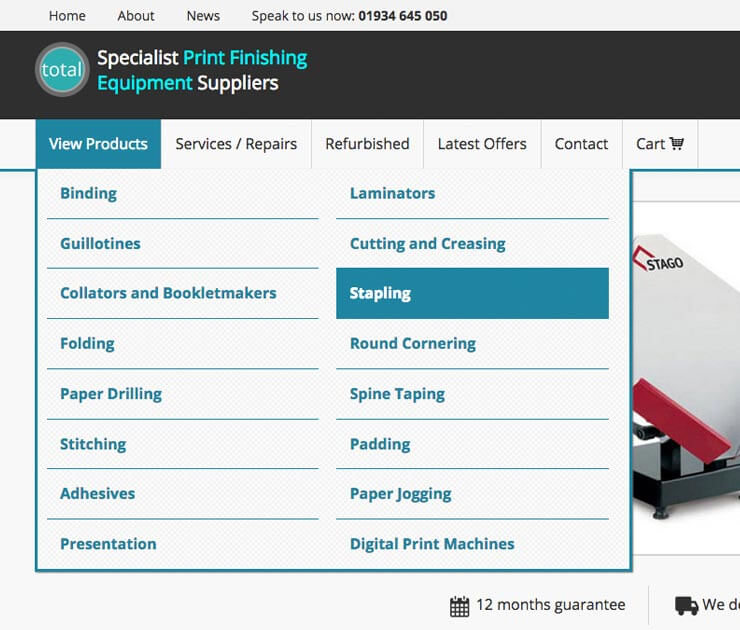
For our redesigned version we opted to remove all the sub-menus from the main nav and only allow users to select the category that they wanted. From there they are taken to an overview page which shows all the sub-category options available. This gives them a clear navigation structure without any of the complexity of the old system.
Getting Technical
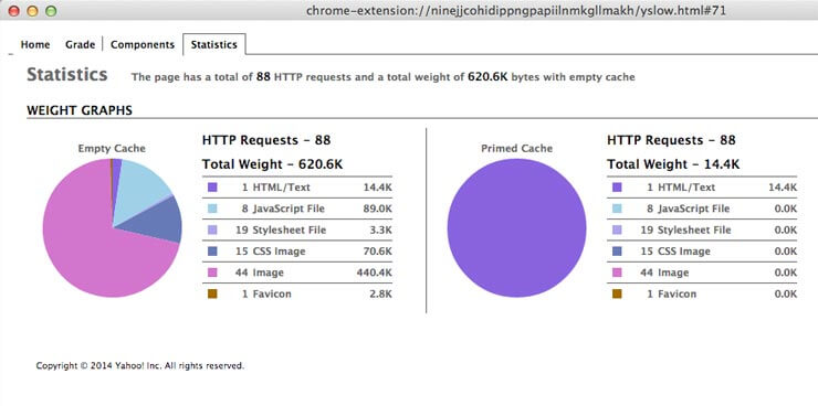
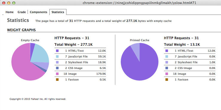
When redesigning a site it’s important to remember that it’s not all about how the site looks. A significant part of having a successful website is having one that responds and loads fast. This is evidenced by studies that show the average impact of a one-second delay means a 7% reduction in conversions. (source)
To help us track performance we recorded speed tests on the old site so we could see what areas were causing the largest impact. The most obvious were the number of javascript and css files that were being loaded. Ensuring they were condensed into as few files as possible and minified along with various other improvements has helped the new site perform much faster.
The results
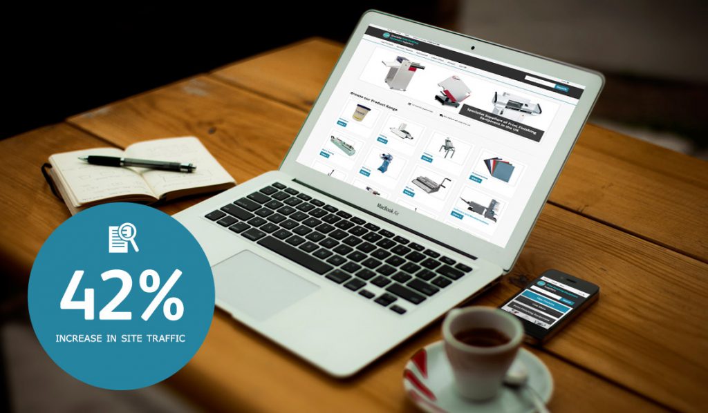
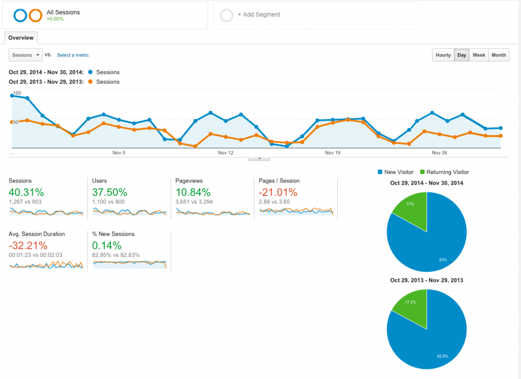
So were all the aforementioned changes worth it, have conversions increased and was the client happy? Yes, yes and yes! Using Google Analytics we can see that the number of people visiting the site has increased by more than 42%, and the number of unique page views has increased by more than 34%. Unsurprisingly the number of sales and enquiries are up too. Take a look at some of the stats below and see for yourself.
Total PFS are loving the new WordPress site we built for them along with reaping the rewards it brings.
If you’ve got a website or a web project you’d like us to take a look at then please get in touch with us via the details on our contact page as we’d be delighted to use our skills to help improve your online presence, and maybe our next new website case study will be about your site!