A fully scalable responsive website design
Websites don’t just sit on your desktop computer anymore, with more and more people owning smartphones capable of full internet access; websites are viewed more and more whilst on the move – from a person doing the morning commute sitting on a bus using a device with a very small screen such as an iPhone to another person sitting in Starbucks using an ipad or someone at home using the latest gigantic 30″ cinema display screen.
What this means is that a website should now work just as brilliantly for a mobile device as they do for a desktop, and that’s something that Tim’s Motor Homes took seriously. So when we redesigned their website we made sure it was designed to be fully scalable and responsive by using a fluid grid and harnessing the power of CSS3 media queries to ensure that the layout adapts to fit whatever size screen it’s being viewed on.
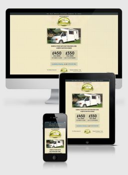
Knowing that people viewing the website using a small screen could easily have more trouble finding crucial information than those with larger screens, we kept the design clean and simple for everyone to understand. It’s straight to the point with a clear contrasting menu, obvious pricing structure, followed by who and how to contact for a booking.
The other main technical aspect besides making the build responsive was incorporating a calendar and booking form that interacted with each other enabling visitors to the site to click on a week of their choosing and make a booking for that period and disabling weeks that are already fully booked. This was achieved by harnessing the power of WordPress with a few additional plugins and a few snippets of custom jQuery code to make the site play nicely with some of the older versions of Internet Explorer.
Are your audience on the move? Do you need a responsive website? Well give us a call on 01823 765171 and we’ll make sure your website looks as good on a mobile as it does on a desktop.